Michael & Feven: Wedding Brand Identity
Designed an original, creative logo for my cousin Michael and his fiance Feven.
00

problem
Michael and Feven wanted a unique wedding logo that reflected their personalities and the significance of their relationship.
solution
Designed an original, creative logo that captured the couple's style and story, creating a meaningful visual identity that could be used consistently across their wedding materials and celebrations.
I had the opportunity to lead the creative direction and overall management of this personal project, applying my expertise to develop a unique and visually engaging design. While the creative process allowed for significant artistic freedom, the primary objective was to ensure that the names "Michael" and "Feven" were prominently displayed and accurately represented throughout the final piece. The project followed a structured design process that included two rounds of revisions before reaching the final proof. Throughout the process, the clients were presented with multiple design options, allowing them to refine their preferences and confidently select the final direction.
[Round 1 Revision]:
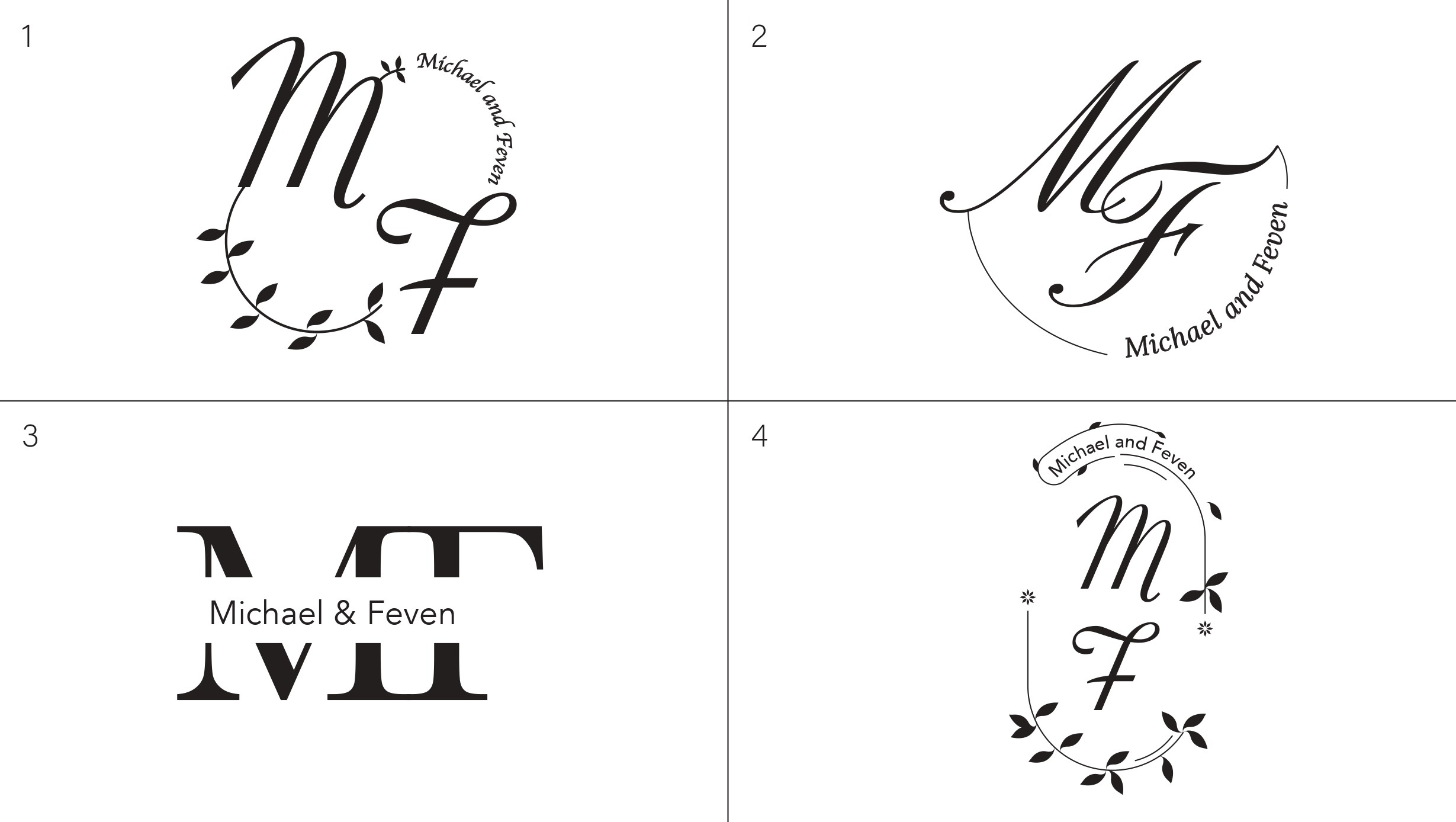

Most of these ideas the clients really liked and it was encouraged to push it further by experimenting with the stylization and letters of "M" and "F" for their initials.
[Round 2 Revision]:

After narrowing the concepts down to three refined options, the clients selected 'Selection 3' as their preferred design. They appreciated its understated elegance, characterized by smooth, rounded forms that created a refined yet subtle aesthetic. The floral element at the center added a distinctive touch that enhanced the overall composition, ultimately making it the final approved design.
[Trial and Error]:
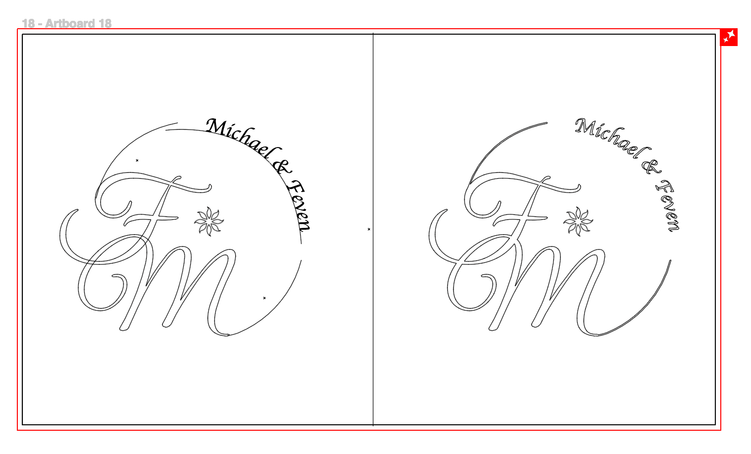
Although this design was selected as the final concept, its tightly grouped letterforms created minor inconsistencies within the overall shape. To improve its visual cohesion, I merged the letterforms and vector paths, expanded their appearance, and converted them into a single solid shape. This refinement produced a cleaner, more balanced composition while allowing colors or gradients to flow seamlessly across the design without disrupting its symmetrical aesthetic.
[Building a Color System]:
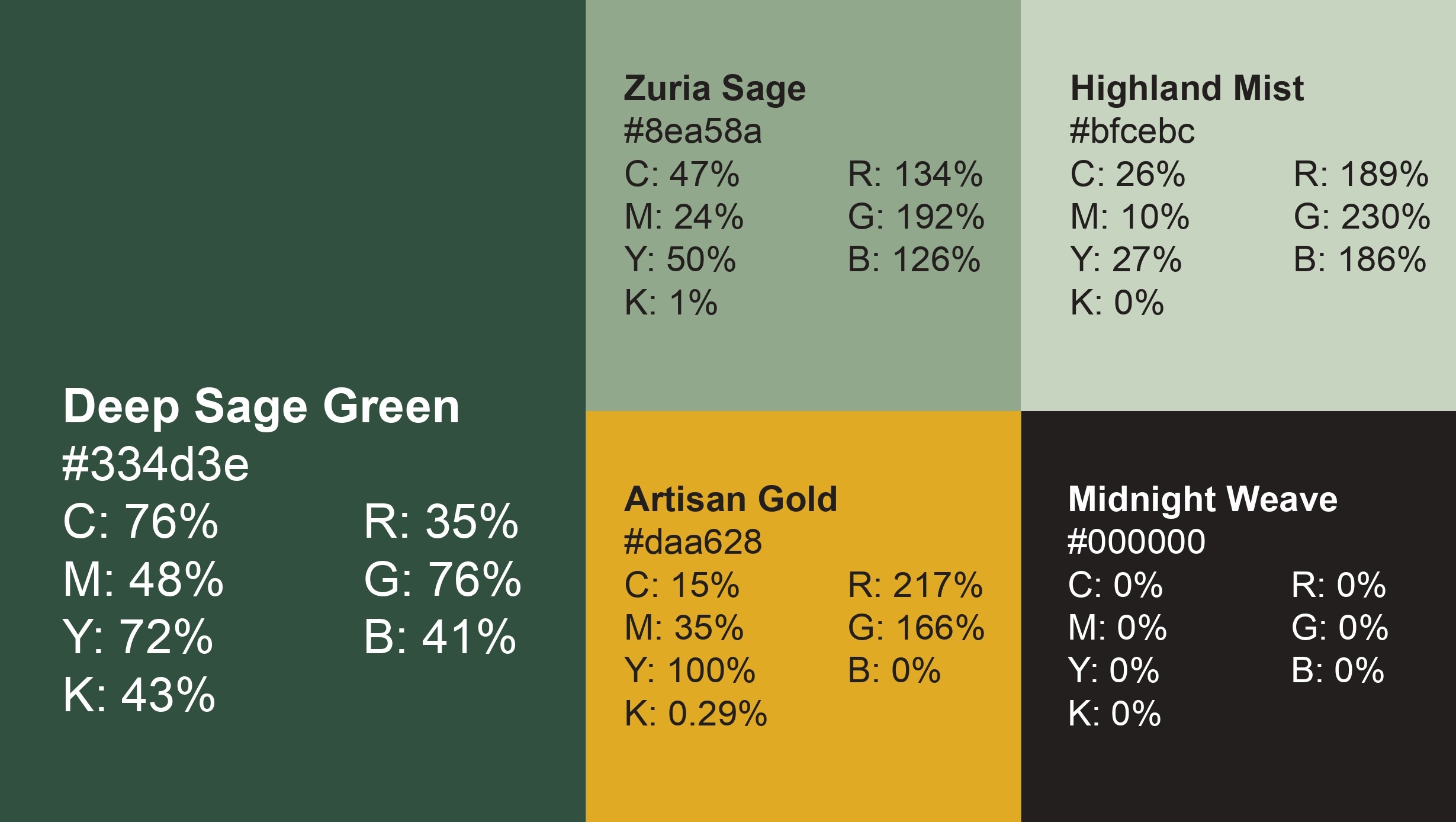
The color palette was inspired by a desire to reflect traditional Eritrean culture and a strong sense of pride and identity. Although the clients were very fond of the black-and-white versions, they ultimately preferred a rich sage green as the primary color, complemented by a bold gold accent for the flower to enhance its visual impact and align with the overall aesthetic.
[The Final Proof]:
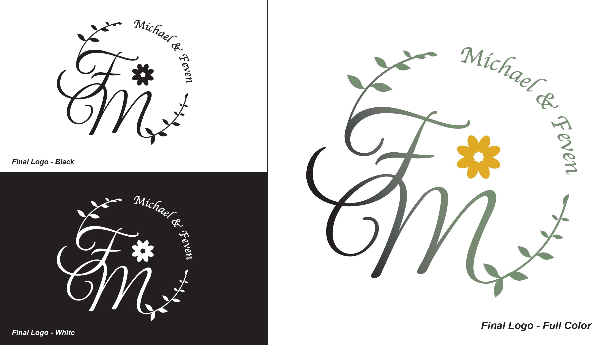
Even in the final stages of the design process, we decided to replace the original stylized flower with a more natural-looking version. We also incorporated detailed leaves along the stem to enhance the overall composition of the logo. This experience taught me that even the smallest design refinements can have a significant impact, resulting in an outcome that is not only stronger but also meaningfully different.
year
2026
timeframe
1 Week
tools
Illustrator
category
Branding and Identity
01