Branding
JP8
As part of a client-driven project, this work involves developing a cohesive visual identity and packaging system for a beer label supporting MSU Denver’s School of Hospitality Veteran Memorial Endowment.
Year :
2025
Industry :
Tivoli & Brewing
Client :
MSU Denver School of Hospitality
Project Duration :
1-2 Months

Problem :
How can I design a beer label and cohesive visual system that honors military veterans—such as Chris Thibodeau—and expresses gratitude for their services?

Solution :
Rather than depending on prominent symbols like flags, I drew inspiration from more understated and nuanced forms of expression, such as Morse code, which often go unnoticed or aren't fully appreciated as meaningful ways of conveying recognition.


The Story :
"JP8" is a military-grade jet fuel.
Chris Thibodeau, who has since passed, is remembered for introducing the name "JP8" into the Tivoli beer line. In a sense, my colleagues and I were entrusted with carrying his vision forward by creating distinctive brand marks that capture his legacy and reflect both the social and military influences behind it.
Learning about Thibodeau's role as a communicator in the army, particularly the use of Morse code as a visual language, was especially inspiring to visually articulate in my process and iterative directions.
What made the project truly distinctive was realizing that it wasn't just about designing beer labels; it was about understanding how they communicate a story and evoke a meaningful, positive sensory experience.
The Process :
30-min Rapid Sketch :
I began the project with a series of rapid sketches to visually explore ideas and establish a clear direction for the concept. My primary objective was to experiment with different variations of “JP8,” allowing myself to work loosely and intuitively while exploring the possibilities of the design.

Digital Iterations :

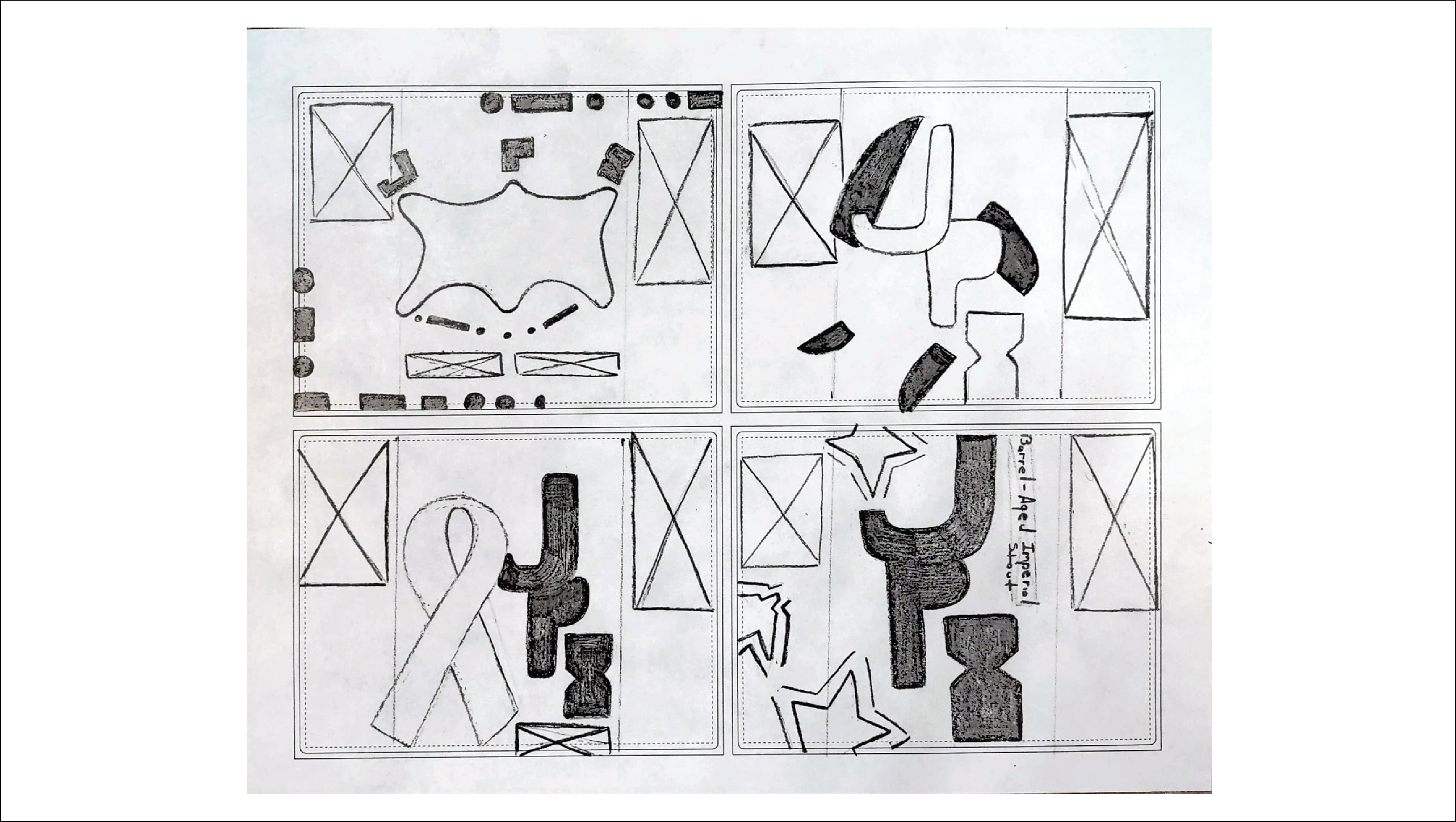
Through the analog-to-digital iteration process, I developed four radical concept directions that offered unique and compelling possibilities. Using the provided beer label dieline, I was encouraged to strategically plan how the design would extend, fold, and appear in relation to the designated bleed lines.
Iterations with Color :
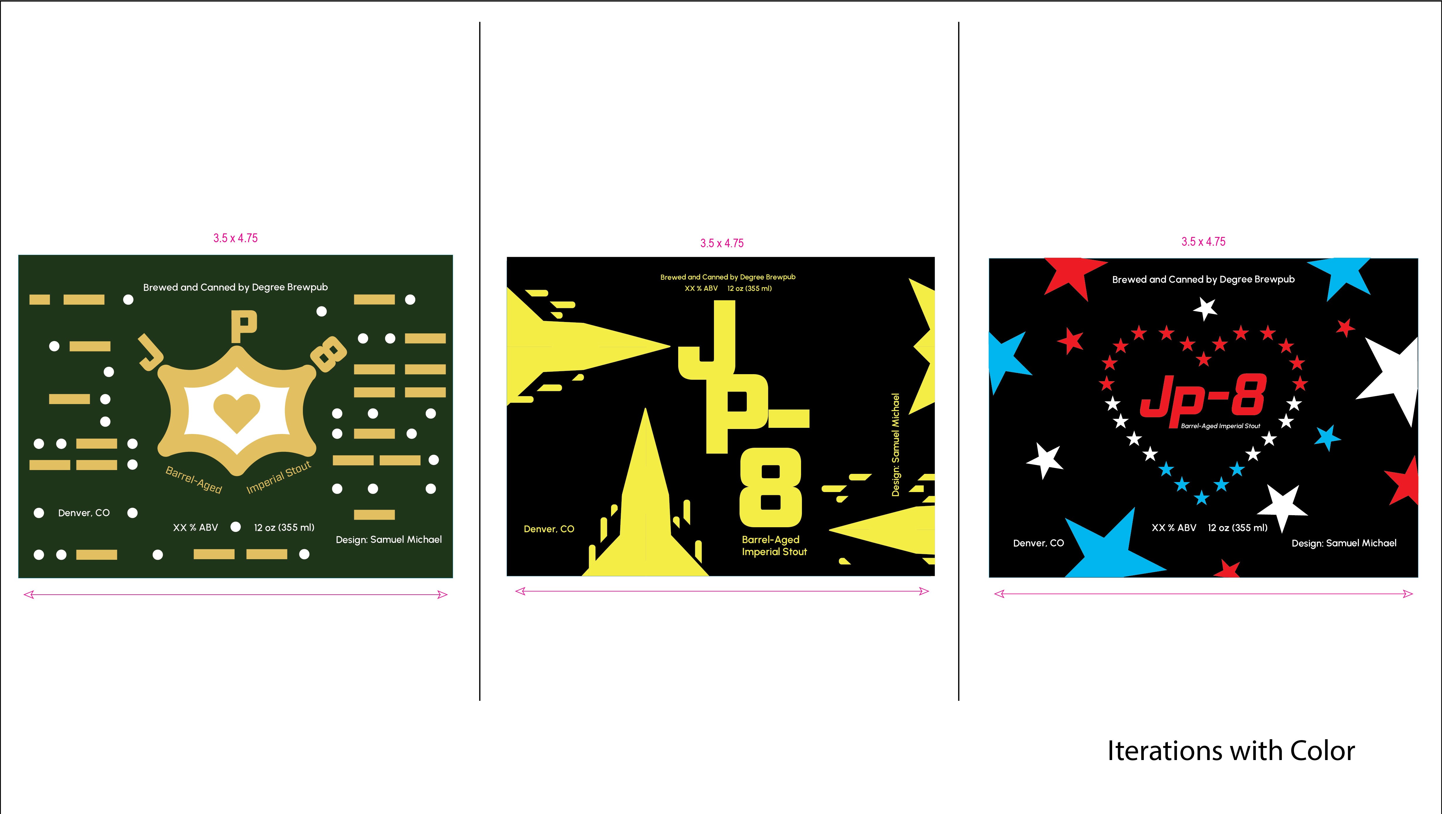
These three options emerged as the top favorites among my colleagues. Through critique, I received strong feedback to revisit Options 2 and 3 and further refine their visual direction, particularly the depiction of the Air Force jet missiles. However, the color system across all three concepts was consistently well received and appreciated.
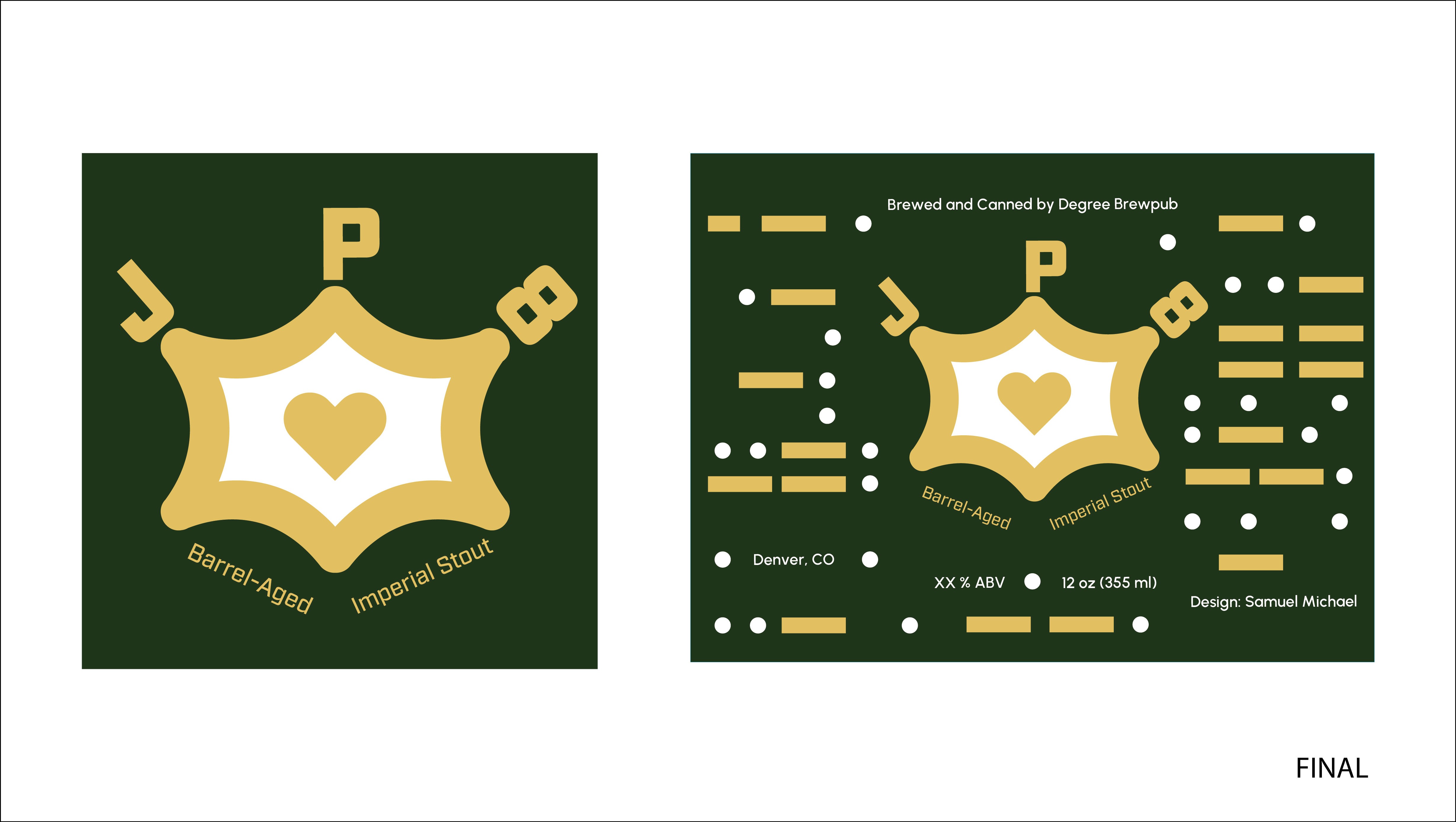
Ultimately, I chose to move forward with Option 1 because I was drawn to its more nuanced approach. I also particularly liked the incorporation of Morse code, which was an element I had been interested in since the early research and development stages of the project.
Final Iteration :
More Projects


Branding
JP8
As part of a client-driven project, this work involves developing a cohesive visual identity and packaging system for a beer label supporting MSU Denver’s School of Hospitality Veteran Memorial Endowment.
Year :
2025
Industry :
Tivoli & Brewing
Client :
MSU Denver School of Hospitality
Project Duration :
1-2 Months
Problem :
How can I design a beer label and cohesive visual system that honors military veterans—such as Chris Thibodeau—and expresses gratitude for their services?
Solution :
Rather than depending on prominent symbols like flags, I drew inspiration from more understated and nuanced forms of expression, such as Morse code, which often go unnoticed or aren't fully appreciated as meaningful ways of conveying recognition.
The Story :
"JP8" is a military-grade jet fuel.
Chris Thibodeau, who has since passed, is remembered for introducing the name "JP8" into the Tivoli beer line. In a sense, my colleagues and I were entrusted with carrying his vision forward by creating distinctive brand marks that capture his legacy and reflect both the social and military influences behind it.
Learning about Thibodeau's role as a communicator in the army, particularly the use of Morse code as a visual language, was especially inspiring to visually articulate in my process and iterative directions.
What made the project truly distinctive was realizing that it wasn't just about designing beer labels; it was about understanding how they communicate a story and evoke a meaningful, positive sensory experience.
The Process :
30-min Rapid Sketch :
I began the project with a series of rapid sketches to visually explore ideas and establish a clear direction for the concept. My primary objective was to experiment with different variations of “JP8,” allowing myself to work loosely and intuitively while exploring the possibilities of the design.
Digital Iterations :
Through the analog-to-digital iteration process, I developed four radical concept directions that offered unique and compelling possibilities. Using the provided beer label dieline, I was encouraged to strategically plan how the design would extend, fold, and appear in relation to the designated bleed lines.
Iterations with Color :
These three options emerged as the top favorites among my colleagues. Through critique, I received strong feedback to revisit Options 2 and 3 and further refine their visual direction, particularly the depiction of the Air Force jet missiles. However, the color system across all three concepts was consistently well received and appreciated.
Ultimately, I chose to move forward with Option 1 because I was drawn to its more nuanced approach. I also particularly liked the incorporation of Morse code, which was an element I had been interested in since the early research and development stages of the project.
Final Iteration :
More Projects
Branding
JP8
As part of a client-driven project, this work involves developing a cohesive visual identity and packaging system for a beer label supporting MSU Denver’s School of Hospitality Veteran Memorial Endowment.
Year :
2025
Industry :
Tivoli & Brewing
Client :
MSU Denver School of Hospitality
Project Duration :
1-2 Months
Problem :
How can I design a beer label and cohesive visual system that honors military veterans—such as Chris Thibodeau—and expresses gratitude for their services?
Solution :
Rather than depending on prominent symbols like flags, I drew inspiration from more understated and nuanced forms of expression, such as Morse code, which often go unnoticed or aren't fully appreciated as meaningful ways of conveying recognition.
The Story :
"JP8" is a military-grade jet fuel.
Chris Thibodeau, who has since passed, is remembered for introducing the name "JP8" into the Tivoli beer line. In a sense, my colleagues and I were entrusted with carrying his vision forward by creating distinctive brand marks that capture his legacy and reflect both the social and military influences behind it.
Learning about Thibodeau's role as a communicator in the army, particularly the use of Morse code as a visual language, was especially inspiring to visually articulate in my process and iterative directions.
What made the project truly distinctive was realizing that it wasn't just about designing beer labels; it was about understanding how they communicate a story and evoke a meaningful, positive sensory experience.
The Process :
30-min Rapid Sketch :
I began the project with a series of rapid sketches to visually explore ideas and establish a clear direction for the concept. My primary objective was to experiment with different variations of “JP8,” allowing myself to work loosely and intuitively while exploring the possibilities of the design.
Digital Iterations :
Through the analog-to-digital iteration process, I developed four radical concept directions that offered unique and compelling possibilities. Using the provided beer label dieline, I was encouraged to strategically plan how the design would extend, fold, and appear in relation to the designated bleed lines.
Iterations with Color :
These three options emerged as the top favorites among my colleagues. Through critique, I received strong feedback to revisit Options 2 and 3 and further refine their visual direction, particularly the depiction of the Air Force jet missiles. However, the color system across all three concepts was consistently well received and appreciated.
Ultimately, I chose to move forward with Option 1 because I was drawn to its more nuanced approach. I also particularly liked the incorporation of Morse code, which was an element I had been interested in since the early research and development stages of the project.
Final Iteration :