Product & Packaging
Queen Bee Hot Sauce
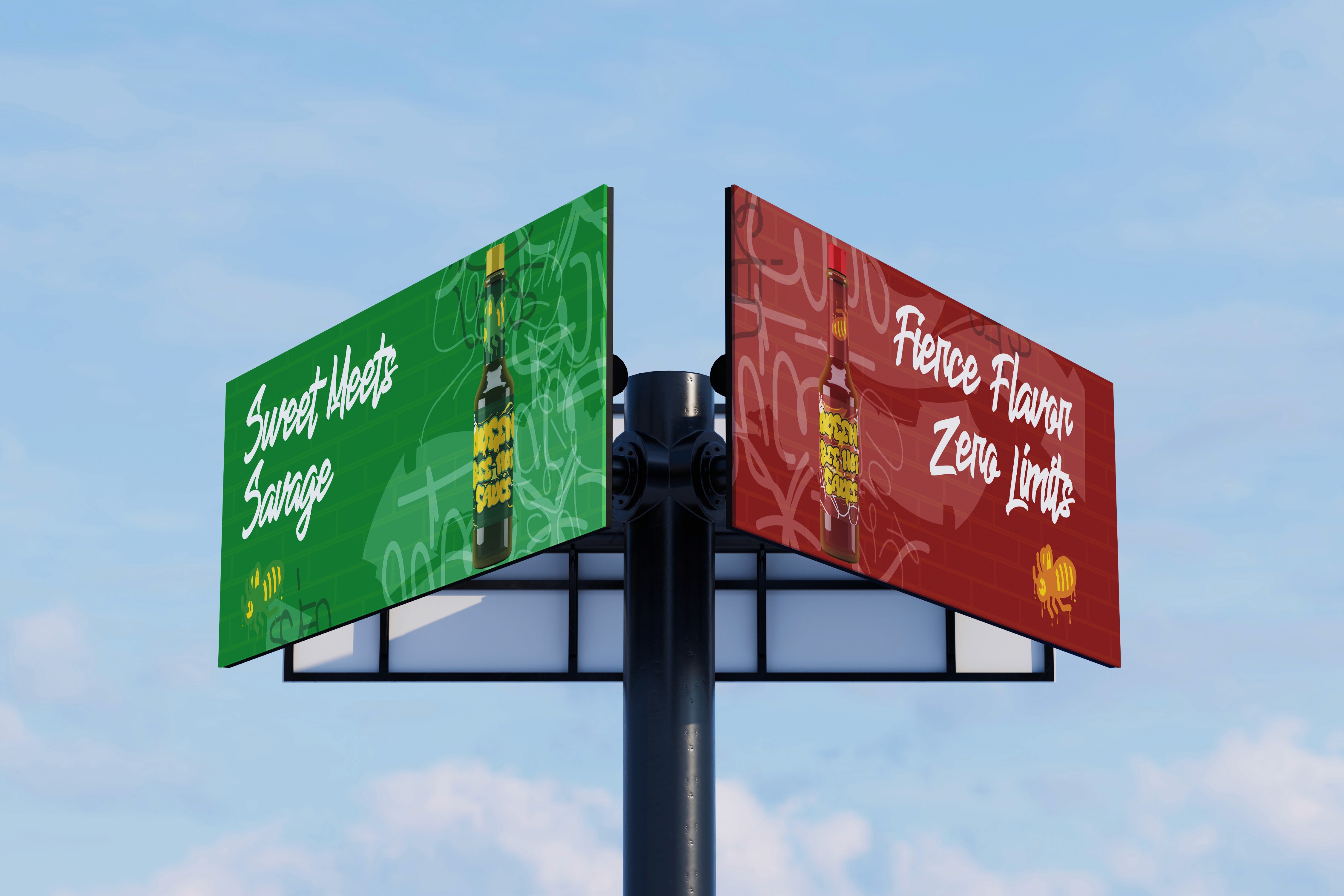
Created a comprehensive product packaging system and visual identity for Queen Bee Hot Sauce, a women-owned business. The brand presents a conceptual artisanal hot sauce line that blends Colorado honey with bold pepper varieties, offering a distinctive sweet-and-heat flavor experience.
Year :
2025
Industry :
Creative Agency
Client :
Queen Bee
Project Duration :
2-3 Weeks

Problem :
How can I translate a brand's rebel archetype that communicates adventure, confidence, and mischief, into a striking, self-dominant product packaging system?

Solution :
Transformed a rebellious, outlaw style of graffiti into a refined design element that resonates with a young, modern audience—reframing it from something chaotic and unpredictable into a distinctive, engaging, and visually compelling feature.


The Story :
While graffiti is often perceived as chaotic and rebellious, the product system reimagines it as a meaningful artistic medium that can evoke nostalgia; highlighting how graffiti's raw expression can be thoughtfully adapted and recontextualized.
Inspired by the Neo-Expressionist movement, particularly the work of Jean-Michel Basquiat, this project embraces abstraction that prioritizes expressive figuration over rigid form. Each symbol is intentionally crafted, drawing from the bold identity of “Queen Bee Hot Sauce” to create a cohesive yet dynamic visual language.
The concept expands across three distinct flavors, ranging from Sting as the lowest, swarm as the mildest, to Venom as the most intense. Each variation is defined by its own color palette, emphasizing both its unique aesthetic and its level of heat.
More Projects


Product & Packaging
Queen Bee Hot Sauce
Created a comprehensive product packaging system and visual identity for Queen Bee Hot Sauce, a women-owned business. The brand presents a conceptual artisanal hot sauce line that blends Colorado honey with bold pepper varieties, offering a distinctive sweet-and-heat flavor experience.
Year :
2025
Industry :
Creative Agency
Client :
Queen Bee
Project Duration :
2-3 Weeks
Problem :
How can I translate a brand's rebel archetype that communicates adventure, confidence, and mischief, into a striking, self-dominant product packaging system?
Solution :
Transformed a rebellious, outlaw style of graffiti into a refined design element that resonates with a young, modern audience—reframing it from something chaotic and unpredictable into a distinctive, engaging, and visually compelling feature.
The Story :
While graffiti is often perceived as chaotic and rebellious, the product system reimagines it as a meaningful artistic medium that can evoke nostalgia; highlighting how graffiti's raw expression can be thoughtfully adapted and recontextualized.
Inspired by the Neo-Expressionist movement, particularly the work of Jean-Michel Basquiat, this project embraces abstraction that prioritizes expressive figuration over rigid form. Each symbol is intentionally crafted, drawing from the bold identity of “Queen Bee Hot Sauce” to create a cohesive yet dynamic visual language.
The concept expands across three distinct flavors, ranging from Sting as the lowest, swarm as the mildest, to Venom as the most intense. Each variation is defined by its own color palette, emphasizing both its unique aesthetic and its level of heat.
More Projects
Product & Packaging
Queen Bee Hot Sauce
Created a comprehensive product packaging system and visual identity for Queen Bee Hot Sauce, a women-owned business. The brand presents a conceptual artisanal hot sauce line that blends Colorado honey with bold pepper varieties, offering a distinctive sweet-and-heat flavor experience.
Year :
2025
Industry :
Creative Agency
Client :
Queen Bee
Project Duration :
2-3 Weeks
Problem :
How can I translate a brand's rebel archetype that communicates adventure, confidence, and mischief, into a striking, self-dominant product packaging system?
Solution :
Transformed a rebellious, outlaw style of graffiti into a refined design element that resonates with a young, modern audience—reframing it from something chaotic and unpredictable into a distinctive, engaging, and visually compelling feature.
The Story :
While graffiti is often perceived as chaotic and rebellious, the product system reimagines it as a meaningful artistic medium that can evoke nostalgia; highlighting how graffiti's raw expression can be thoughtfully adapted and recontextualized.
Inspired by the Neo-Expressionist movement, particularly the work of Jean-Michel Basquiat, this project embraces abstraction that prioritizes expressive figuration over rigid form. Each symbol is intentionally crafted, drawing from the bold identity of “Queen Bee Hot Sauce” to create a cohesive yet dynamic visual language.
The concept expands across three distinct flavors, ranging from Sting as the lowest, swarm as the mildest, to Venom as the most intense. Each variation is defined by its own color palette, emphasizing both its unique aesthetic and its level of heat.