UI / UX Design
RTD App Redesign
Created a redesign experience for the RTD mobile app.
Year :
2025
Industry :
Creative Agency
Client :
RTD (Regional Transportation District)
Project Duration :
1-2 Months

Problem :
How might I redesign the RTD mobile app experience to make trip planning, ticket purchasing, and real-time transit information more intuitive, efficient, and accessible for riders?

Solution :
By designing a reimagined mobile app experience that moves beyond RTD’s existing design language and interface system to deliver a more distinctive, intuitive, and seamless user experience.
The Process :
I began the process by creating a mood board that gathered UI patterns, visual references, and design aesthetics that resonated with me. While RTD already has a bright and well-established visual system, I became interested in exploring an alternative direction: imagining how the overall experience might feel if it were designed around a dark-mode interface from the ground up.

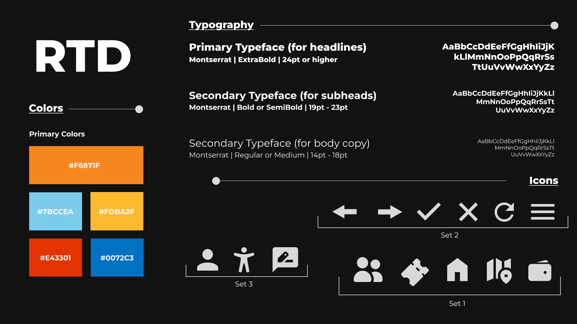
I chose to feature a dominant orange against a dark UI background as a deliberate departure from RTD’s current bright color palette. Wanting to avoid the familiar red and blue, I opted for orange to evoke a more industrial, modernist feel while introducing a fresh and distinctive look.

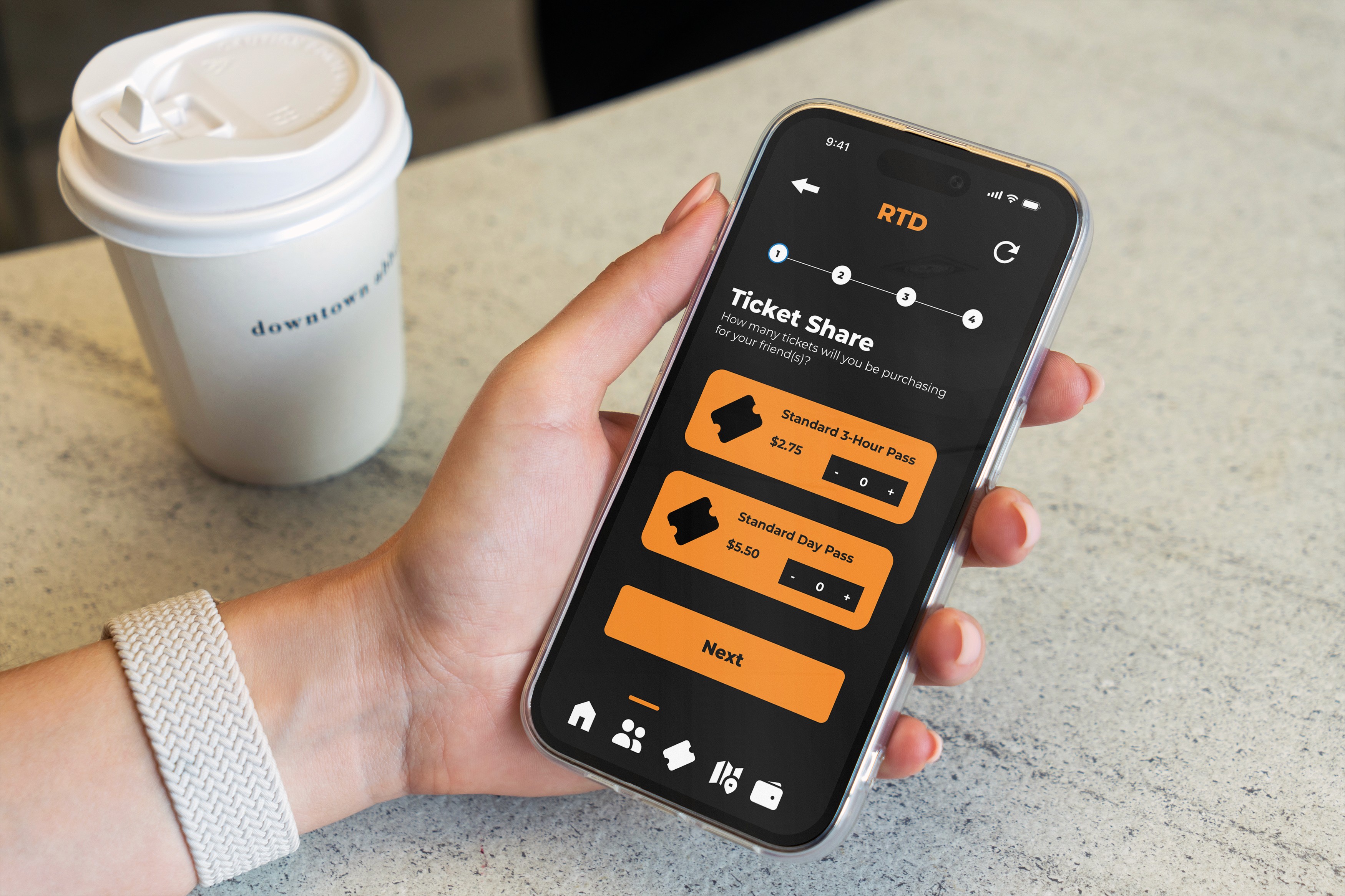
In redesigning the interface, I proposed a new feature allowing users to share tickets within the RTD app—for example, purchasing a ticket for someone else and sending it via text. This addition would enhance user engagement and affordability, transforming the app from a solely individual experience to one that supports social interaction.
The Challenge :
Part of the project involved designing the mobile app system for a smartphone interface, while also adapting it for an Apple Watch. The main challenge was translating the existing UI system into a smaller, more compact interface while maintaining usability, consistency, and functionality across both devices.
More Projects


UI / UX Design
RTD App Redesign
Created a redesign experience for the RTD mobile app.
Year :
2025
Industry :
Creative Agency
Client :
RTD (Regional Transportation District)
Project Duration :
1-2 Months
Problem :
How might I redesign the RTD mobile app experience to make trip planning, ticket purchasing, and real-time transit information more intuitive, efficient, and accessible for riders?
Solution :
By designing a reimagined mobile app experience that moves beyond RTD’s existing design language and interface system to deliver a more distinctive, intuitive, and seamless user experience.
The Process :
I began the process by creating a mood board that gathered UI patterns, visual references, and design aesthetics that resonated with me. While RTD already has a bright and well-established visual system, I became interested in exploring an alternative direction: imagining how the overall experience might feel if it were designed around a dark-mode interface from the ground up.
I chose to feature a dominant orange against a dark UI background as a deliberate departure from RTD’s current bright color palette. Wanting to avoid the familiar red and blue, I opted for orange to evoke a more industrial, modernist feel while introducing a fresh and distinctive look.
In redesigning the interface, I proposed a new feature allowing users to share tickets within the RTD app—for example, purchasing a ticket for someone else and sending it via text. This addition would enhance user engagement and affordability, transforming the app from a solely individual experience to one that supports social interaction.
The Challenge :
Part of the project involved designing the mobile app system for a smartphone interface, while also adapting it for an Apple Watch. The main challenge was translating the existing UI system into a smaller, more compact interface while maintaining usability, consistency, and functionality across both devices.
More Projects
UI / UX Design
RTD App Redesign
Created a redesign experience for the RTD mobile app.
Year :
2025
Industry :
Creative Agency
Client :
RTD (Regional Transportation District)
Project Duration :
1-2 Months
Problem :
How might I redesign the RTD mobile app experience to make trip planning, ticket purchasing, and real-time transit information more intuitive, efficient, and accessible for riders?
Solution :
By designing a reimagined mobile app experience that moves beyond RTD’s existing design language and interface system to deliver a more distinctive, intuitive, and seamless user experience.
The Process :
I began the process by creating a mood board that gathered UI patterns, visual references, and design aesthetics that resonated with me. While RTD already has a bright and well-established visual system, I became interested in exploring an alternative direction: imagining how the overall experience might feel if it were designed around a dark-mode interface from the ground up.
I chose to feature a dominant orange against a dark UI background as a deliberate departure from RTD’s current bright color palette. Wanting to avoid the familiar red and blue, I opted for orange to evoke a more industrial, modernist feel while introducing a fresh and distinctive look.
In redesigning the interface, I proposed a new feature allowing users to share tickets within the RTD app—for example, purchasing a ticket for someone else and sending it via text. This addition would enhance user engagement and affordability, transforming the app from a solely individual experience to one that supports social interaction.
The Challenge :
Part of the project involved designing the mobile app system for a smartphone interface, while also adapting it for an Apple Watch. The main challenge was translating the existing UI system into a smaller, more compact interface while maintaining usability, consistency, and functionality across both devices.